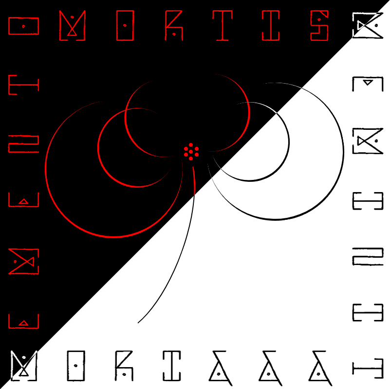
A poster made entirely of HTML and CSS code you can view the CSS code below.
@import url(“https://fonts.googleapis.com/css2?family=Sankofa+Display&display=swap”);
.body {
margin: 0;
font-family: “Cormorant Garamond”, serif;
background-color: white;
}
.container {
width: 1000px;
height: 1000px;
background: black;
overflow: hidden;
z-index: 0;
}
.whiteBox {
width: 2000px;
height: 2000px;
background-color: rgb(255, 255, 255);
transform: rotate(45deg);
position: relative;
top: 114px;
left: 300px;
z-index: 1;
}
.curveLine {
width: 500px;
height: 100px;
border: solid 3.5px;
border-color: #000000 transparent transparent transparent;
border-radius: 50%/100px 100px 0 0;
position: relative;
top: -1420px;
left: 165px;
transform: rotate(110deg);
z-index: 2;
}
.curveLine8 {
width: 75px;
height: 90px;
border: solid 3.9px;
border-color: #ff0000 transparent transparent transparent;
border-radius: 850%/100px 100px 0 0;
position: relative;
top: -1687px;
left: 411px;
transform: rotate(87deg);
z-index: 2;
}
.curveLine2 {
height: 350px;
width: 350px;
border-bottom-width: 5px;
border-top-width: 0;
border-left-width: 0;
border-right-width: 1;
border-style: solid;
border-color: white;
position: relative;
top: -1990px;
left: 530px;
border-radius: 2000px;
transform: rotate(-10deg);
mix-blend-mode: difference;
z-index: 3;
}
.curveLine3 {
height: 350px;
width: 350px;
border-bottom-width: 5px;
border-top-width: 0;
border-left-width: 1;
border-right-width: 0;
border-style: solid;
border-color: red;
position: relative;
top: -2300px;
left: 115px;
border-radius: 2000px;
transform: rotate(-10deg);
z-index: 4;
}
.curveLine4 {
height: 300px;
width: 200px;
border-bottom-width: 5px;
border-top-width: 0;
border-left-width: 0;
border-right-width: 0;
border-style: solid;
border-color: red;
position: relative;
top: -2780px;
left: 390px;
border-radius: 2000px;
transform: rotate(-85deg);
z-index: 5;
}
.curveLine5 {
height: 300px;
width: 200px;
border-bottom-width: 5px;
border-top-width: 0;
border-left-width: 0;
border-right-width: 0;
border-style: solid;
border-color: red;
position: relative;
top: -3080px;
left: 370px;
border-radius: 2000px;
transform: rotate(75deg);
z-index: 6;
}
.curveLine6 {
height: 200px;
width: 200px;
border-bottom-width: 5px;
border-top-width: 0;
border-left-width: 0;
border-right-width: 1;
border-style: solid;
border-color: rgb(255, 255, 255);
position: relative;
top: -3260px;
left: 540px;
border-radius: 2000px;
transform: rotate(-20deg);
mix-blend-mode: difference;
z-index: 5;
}
.curveLine7 {
height: 200px;
width: 200px;
border-bottom-width: 5px;
border-top-width: 0;
border-left-width: 1;
border-right-width: 0;
border-style: solid;
border-color: red;
position: relative;
top: -3450px;
left: 250px;
border-radius: 2000px;
transform: rotate(30deg);
z-index: 6;
}
.dot1 {
width: 10px;
height: 10px;
background: red;
border-radius: 150px;
position: relative;
top: -3565px;
left: 485px;
transform: rotate(-15deg);
z-index: 20;
}
.dot2 {
width: 10px;
height: 10px;
background: red;
border-radius: 150px;
position: relative;
top: -3558px;
left: 485px;
transform: rotate(-50deg);
z-index: 20;
}
.dot3 {
width: 10px;
height: 10px;
background: red;
border-radius: 150px;
position: relative;
top: -3575px;
left: 500px;
transform: rotate(55deg);
z-index: 20;
}
.dot4 {
width: 10px;
height: 10px;
background: red;
border-radius: 150px;
position: relative;
top: -3570px;
left: 500px;
transform: rotate(25deg);
z-index: 20;
}
.dot5 {
width: 10px;
height: 10px;
background: red;
border-radius: 150px;
position: relative;
top: -3595px;
left: 472px;
transform: rotate(25deg);
z-index: 20;
}
.dot6 {
width: 10px;
height: 10px;
background: red;
border-radius: 150px;
position: relative;
top: -3580px;
left: 485px;
transform: rotate(25deg);
z-index: 20;
}
.dot7 {
width: 10px;
height: 10px;
background: red;
border-radius: 150px;
position: relative;
top: -3600px;
left: 472px;
transform: rotate(25deg);
z-index: 20;
}
.memento {
color: rgb(255, 0, 0);
font-size: 7em;
font-family: “Sankofa Display”, serif;
position: relative;
top: -3720px;
left: -445px;
transform: rotate(-90deg);
letter-spacing: 97px;
z-index: 1;
}
.mori {
color: rgb(255, 255, 255);
font-size: 7em;
font-family: “Sankofa Display”, serif;
position: relative;
top: -3270px;
left: 23px;
letter-spacing: 68px;
mix-blend-mode: difference;
z-index: 1;
}
.mortis {
color: rgb(255, 0, 0);
font-size: 7em;
font-family: “Sankofa Display”, serif;
position: relative;
top: -4280px;
left: 147px;
letter-spacing: 70px;
z-index: 1;
}
.meminit {
color: white;
font-size: 7em;
font-family: “Sankofa Display”, serif;
position: relative;
top: -3948px;
left: 450px;
transform: rotate(90deg);
letter-spacing: 89px;
mix-blend-mode: difference;
z-index: 1;
}